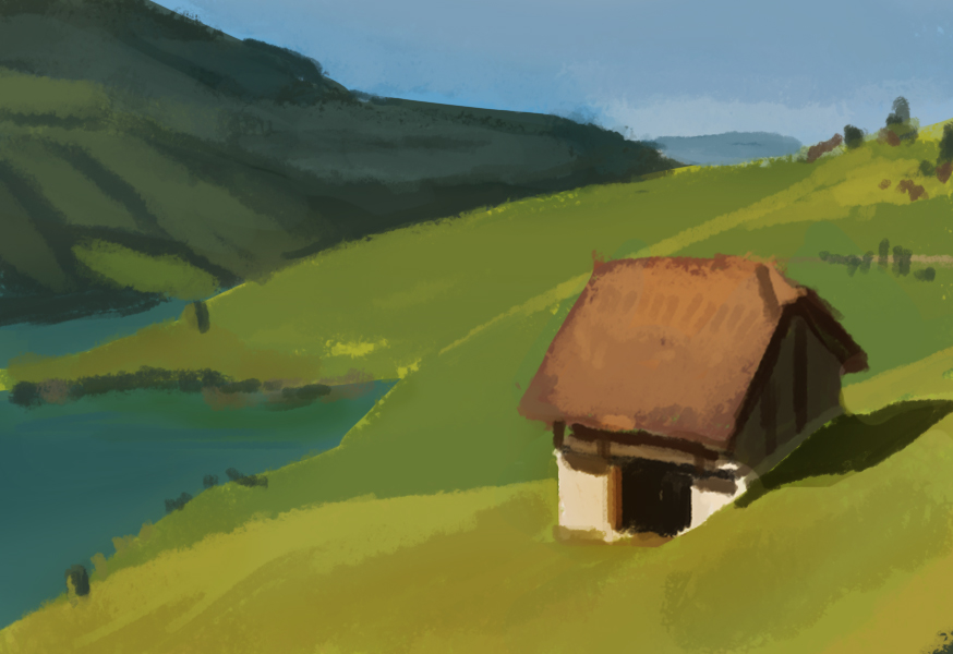
I love how you caught the warmth of the reference. The only thing I would have to comment on is the mountains in the back which might have to be slightly bluer 'cause of the atmospheric perspective. Good job of capturing the light in 30 minutes. :)
It's awesome that you're sticking to it even if you are stressed. You are doing really really good Jonathan! But don't let the color fool you. Jonathan A is right that the mountain is bluer but it's also a lot lighter. It looks darker but if you turn the reference image to grayscale you will realize that the background hill has the same value...almost lighter than the foreground hill. And the far mountain range is very close to the value of the sky. You made it a bit too dark. There should be less contrast in the distance. For your next original painting which should be tomorrow right? You should try to paint a similar setting. Maybe a house (with white walls) on a cornfield with sunny blue sky and a distance mountain range in the back. Something simple like that. Make sure to have a light and shadow side on the house and really think about the light direction, bounce light and such. You might wanna do a quick drawing indicating where the shadows will fall. That might help once you get into colors. If you are not doning it already, start with a mid tone that is within the pallette. Not with a white canvas. That way you can work towards highlights and shadows. With white you can only go darker which makes it hard to keep track on the values. Good Luck you're doing great!
Thanks for the crit Goro. I'll try out that original painting tomorrow. Also, now that Ive gotten some things in order, I'm not stressing to bad over finals. I'm actually excited to see what i produce for the finals of the 2 art classes I'm in.


I love how you caught the warmth of the reference. The only thing I would have to comment on is the mountains in the back which might have to be slightly bluer 'cause of the atmospheric perspective. Good job of capturing the light in 30 minutes. :)
ReplyDeleteAgreed, and thanks!
ReplyDeleteIt's awesome that you're sticking to it even if you are stressed. You are doing really really good Jonathan!
ReplyDeleteBut don't let the color fool you. Jonathan A is right that the mountain is bluer but it's also a lot lighter. It looks darker but if you turn the reference image to grayscale you will realize that the background hill has the same value...almost lighter than the foreground hill. And the far mountain range is very close to the value of the sky. You made it a bit too dark. There should be less contrast in the distance. For your next original painting which should be tomorrow right? You should try to paint a similar setting. Maybe a house (with white walls) on a cornfield with sunny blue sky and a distance mountain range in the back. Something simple like that. Make sure to have a light and shadow side on the house and really think about the light direction, bounce light and such. You might wanna do a quick drawing indicating where the shadows will fall. That might help once you get into colors. If you are not doning it already, start with a mid tone that is within the pallette. Not with a white canvas. That way you can work towards highlights and shadows. With white you can only go darker which makes it hard to keep track on the values. Good Luck you're doing great!
Thanks for the crit Goro. I'll try out that original painting tomorrow. Also, now that Ive gotten some things in order, I'm not stressing to bad over finals. I'm actually excited to see what i produce for the finals of the 2 art classes I'm in.
ReplyDelete